

Clearly Different: HK Express’ Rebranding as a Low-Cost Carrier
Share
APEX Insight: For any rebrand project, concept is key, but for Hong Kong Express’ rebrand into low-cost carrier HK Express, defining the airline’s brand in the rapidly growing Asian market was crucial. For Daniel Baron, LIFT Strategic Design’s CEO, it was a delicious challenge.
“I have to make a confession,” said Daniel Baron, LIFT Strategic Design’s chief executive officer, during his presentation today at the Passenger Experience Conference in Hamburg, Germany. “I think I am the luckiest airline designer in the world.” In 2013, Hong Kong Express elected to reinvent itself as a low-cost carrier (LCC), and Baron counts himself lucky to have been the designer tasked with the leading rebrand.
The task, in sum, involved “Quickly transforming an existing brand into something completely different that had to be perceived and accepted and admired as Hong Kong’s hometown low airfare airline,” says Baron, who described it as a “delicious challenge.”
Before getting into design details, Baron says that the project begins with gaining a deep understanding of the airline’s market, its customers and its competitors. “This project was very much about owning the LCC in the Hong Kong market,” he explained, acknowledging Cathay Pacific and Dragonair as prime competitors.
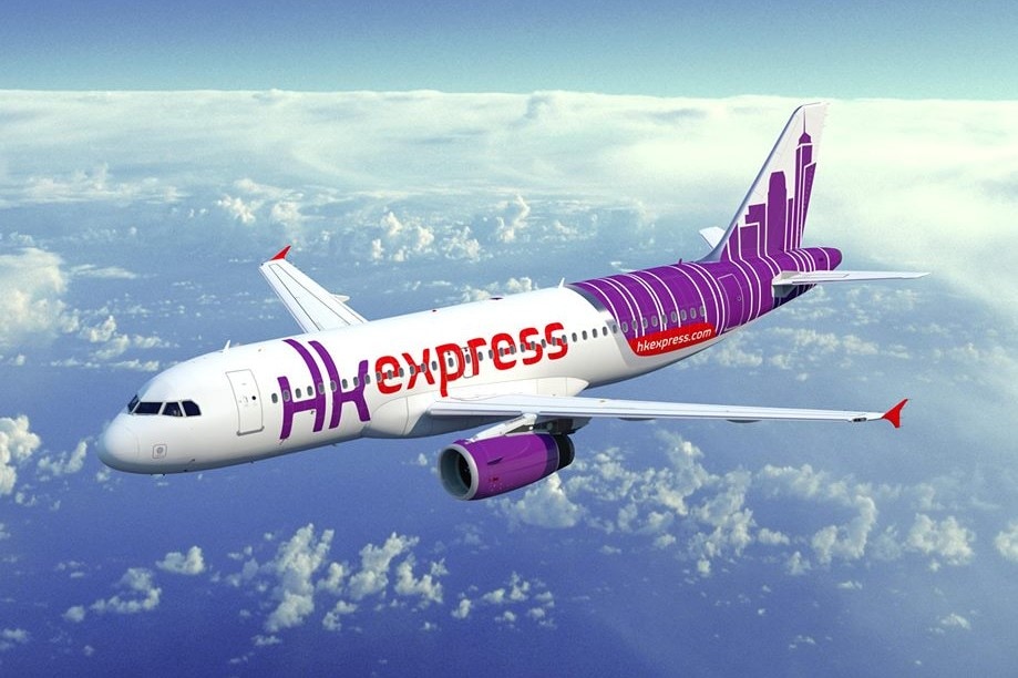
The refreshed livery of HK Express’ fleet – which will grow from 13 to 50 aircraft by the end of 2018 – brings together the objects of the rebrand in several ways. Hong Kong’s skyline decorates the aircraft in the airline’s trademark purple color, and a red swoosh below advertises the airline’s website. The airline claims the title of “Hong Kong’s low fare airline,” by labeling it as such, right at the front of the aircraft, just below the nose.
Each aircraft is named after dim sum dishes – a move that ties the brand to place, but has also proven popular with the airline’s younger travelers – 46 percent of its passengers are between 18 and 29 years old. “I’ve witnessed people taking selfies in front of the aircraft [where the name is] as they board,” Baron shares.
“The Hong Kong skyline is now a carpet.” – Daniel Baron, CEO, LIFT Strategic Design
Hong Kong’s skyline enters the cabin in various ways as well. The partitions and cabin walls depict the city’s buildings in metallic dots of various sizes, so it’s not overpowering. “The Hong Kong skyline is now a carpet,” Baron announced. The skyline weaves its way into the carpet threads in a red, purple and grey pattern. The Sweet Seats – more spacious extra charge seats in the front of the aircraft – are identified by a synthetic red leather, while the main cabin seats take a purple accent color. “The price for red leather is the same price as grey leather, so why not do something interesting?” he asks.
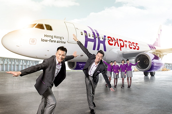
Crew uniforms incorporate visual elements of the airline’s brand in color and shape. The purple swoosh collar on the female uniform echoes the swoosh on the livery. “It’s important there’s a visual link,” Baron notes.
Ultimately, Baron concludes that a good branding project is about finding the airline’s contextualized offer. “Every airline has something unique about it, from which you can develop an interesting concept,” Baron says. “Be clearly different.”