


Minimalist Maps

Share
In 1933, Henry Charles Beck (known by most as Harry Beck) revolutionized cartographic aesthetics with his minimalist, electric-circuit-inspired rendering of the London Tube, a style that he referred to as “the diagram.” Beck’s map ignored everything above the tunnels except for the Thames River, based on the idea that unnecessary topographical features impeded the map’s legibility.
Shortly after, in 1936, designer László Moholy-Nagy produced the “Imperial Airways Map of Empire & European Air Routes,” evidently inspired by Beck’s unprecedented abstract style. Several other designers followed suit, producing uncluttered linear route maps for TAP Portugal, Canadian Pacific Airlines, Czech Airlines, Sudan Airlines and many others – setting Beck’s minimalism as the standard for airline route maps for several decades. Below are some of the APEX media team’s favorites.

Terri, Editor: This old airline ad reminds me of CP Rail, and if not for the typical curved flight route lines this map could easily be mistaken for a vintage train map. I love the terminology of “gateways” to various destinations, and of course the scale is so far off it’s amusing.
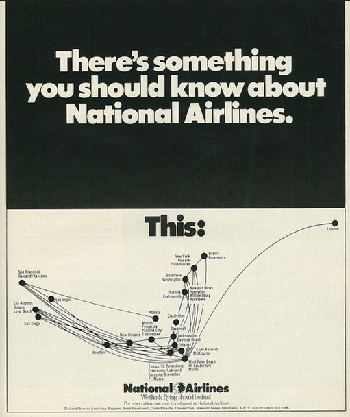
Katie, Assistant Editor: Admittedly, part of the reason I like this map has more to do with the sassy and bold-faced copy, but I like the way this map gets straight to the point.
Al, Publisher: I like National. Less for the map and more for one of the coolest airline logos ever.
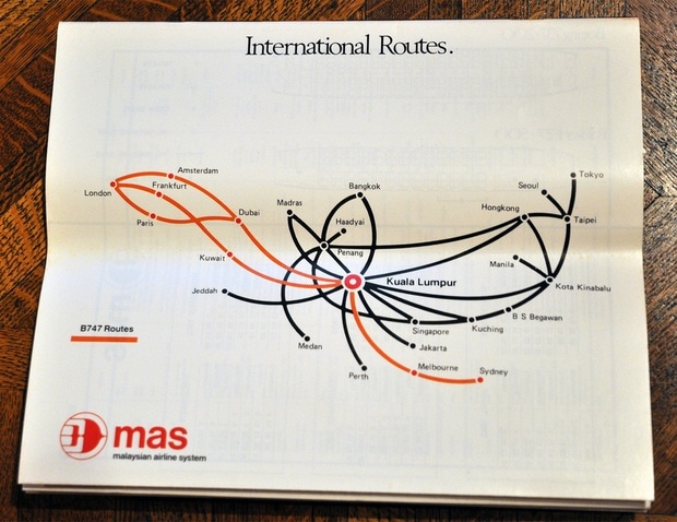
Nicolas, Art Director: Simple lines, good font and very good use of color.
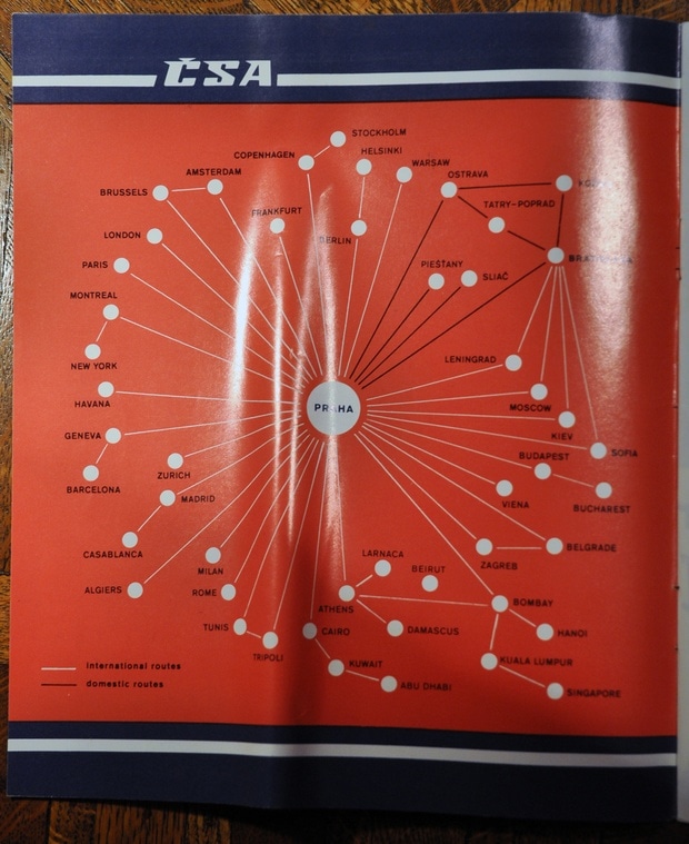
Eva, Designer : My favorite is the Czech Airlines, 1982 map. Timeless, clearly and functionally designed.
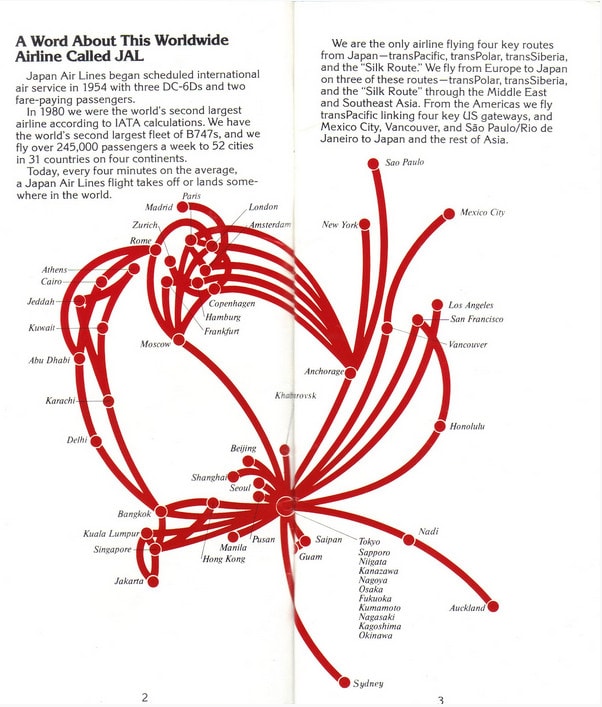
Jessica, Community Manager: This JAL route map is the essence of minimalist. The red and white represents the branding of the airline and I appreciate the informative blurb that comes with it. And who needs a world map on a route map anyways?