[PHOTOS] JAL Readies for Inbound Tourism Influx With New Cabin Design by Tangerine
Share
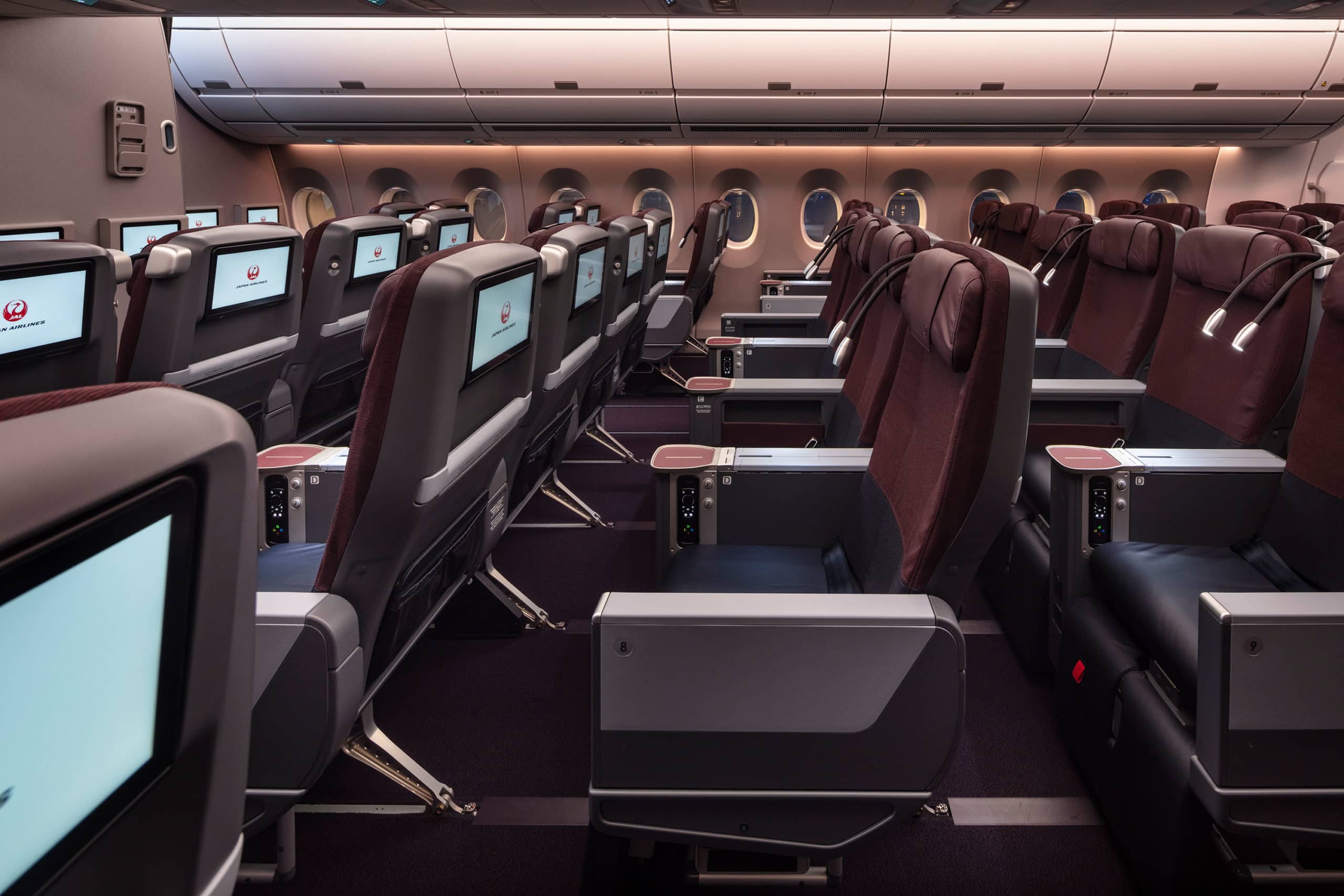
With the upcoming Rugby World Cup beginning in September and the Summer Olympics next year, the number of foreign tourists in Japan is expected to surge. The country’s flag carrier will meet demands for domestic travel with a new fleet of Airbus A350 XWBs – the first of which, an A350-900, is slated to fly on September 1, from Fukuoka to Tokyo.
Every flag carrier must wrestle with the challenge of simultaneously representing its nationals, appealing to its foreign visitors and meeting the needs and desires of both. But when a market is experiencing explosive tourism growth – as is the case with Japan, whose government in 2016 announced an objective of 40 million inbound international travelers by 2020 – this is brought into even sharper relief.
Exactly one month after Tokyo won its bid to host the 2020 Olympic games, Japan Airlines (JAL) announced that it had signed a purchase agreement for 31 A350 XWBs (18 A350-900s and 13 A350-1000s), plus options for a further 25 aircraft. Following that announcement, JAL issued an international tender competition to select a design partner. Armed with three decades of work with Japanese companies including Nikon, Toyota and Seiko, tangerine won the brief, inheriting with it the challenge of outfitting the wide-body A350s (capable of flying routes of about 8,000 nautical miles) into a domestic short-haul product fit for locals and foreigners alike.
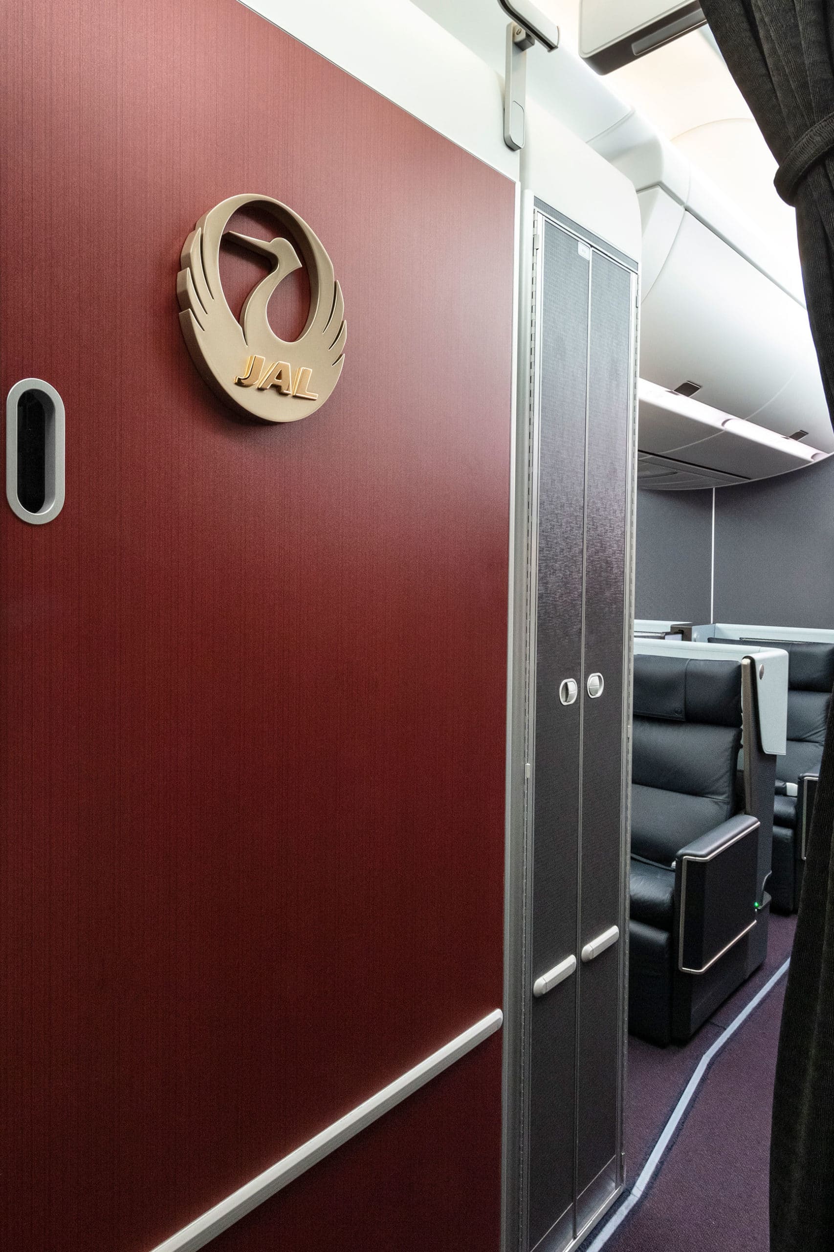
“Until now JAL’s brand image has been quite traditional and domestic, but with 2020 they knew they needed to be more international and modern, while still retaining that Japanese feel,” tangerine’s creative lead and head of Japan Business, Yuichi Ishihara, says. After conducting interviews and workshops with executive management, the firm landed on a strategy it calls Infused Essence. “We start with a tradition: be it culture, architecture or behavior and then look at how we can bring a contemporary element that appeals to international travelers,” Ishihara says. “It’s all about playing with double imagery and messaging.”
Ishihara points to the double duty played by the use of color throughout the cabin as an example. There’s the red wall that greets passengers as they enter the aircraft, which draws on the airline’s brand identity, but also resembles the pigment of European red wines. And the aircraft’s dark sidewalls (the only A350 to feature them), which conform with Japanese design principles but when paired with a white ceiling and overhead bins still achieve that airiness revered in the designs in the west.
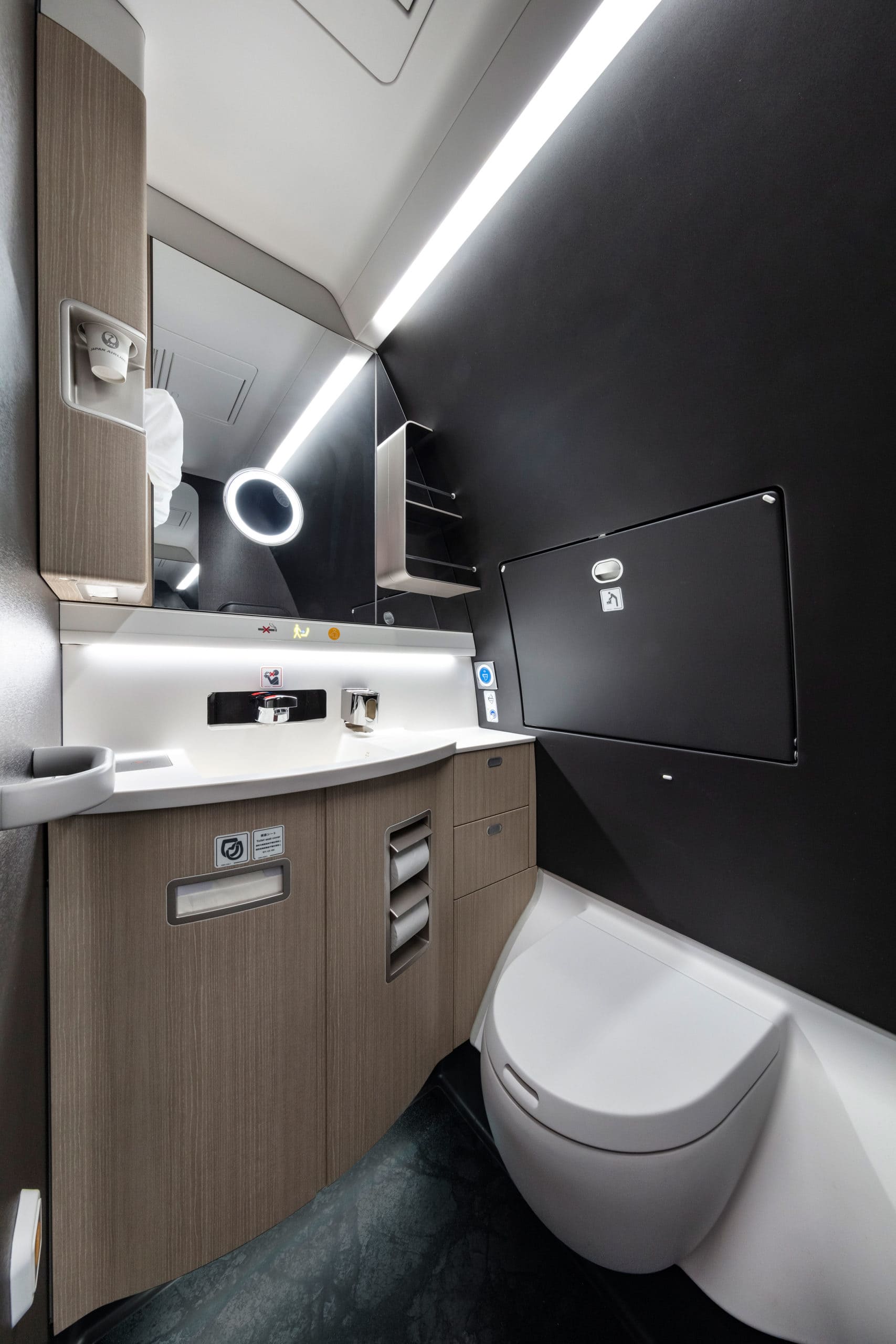
Dark colors are also used in the lavatory to achieve an intimate, luxurious feeling. “In Europe people tend to treat small spaces with light colors, but if you go to Japan, you’ll see lots of them with very dark colors to make the spaces feel rich. We did the same thing here, but by adding a metallic copper overprint to the walls, we got some movement in them and that caught the light within the bathroom,” Matt Round, tangerine’s chief creative officer explains, adding that these colors and textures are contrasted with the pale oak grain pattern on the vanity and the subtle lighting on the stone-like floor.
The mixing of materials, colors, patterns and textures is common in Japanese culture and is used to create spatial divisions without imposing a hard break, Round says. “We looked at how we could imply borders between spaces rather than providing strict physical borders, and one way was by trying to get as much texture into the interior as possible. If you walk into any Japanese environment, it’s amazingly rich with texture,” Round adds.
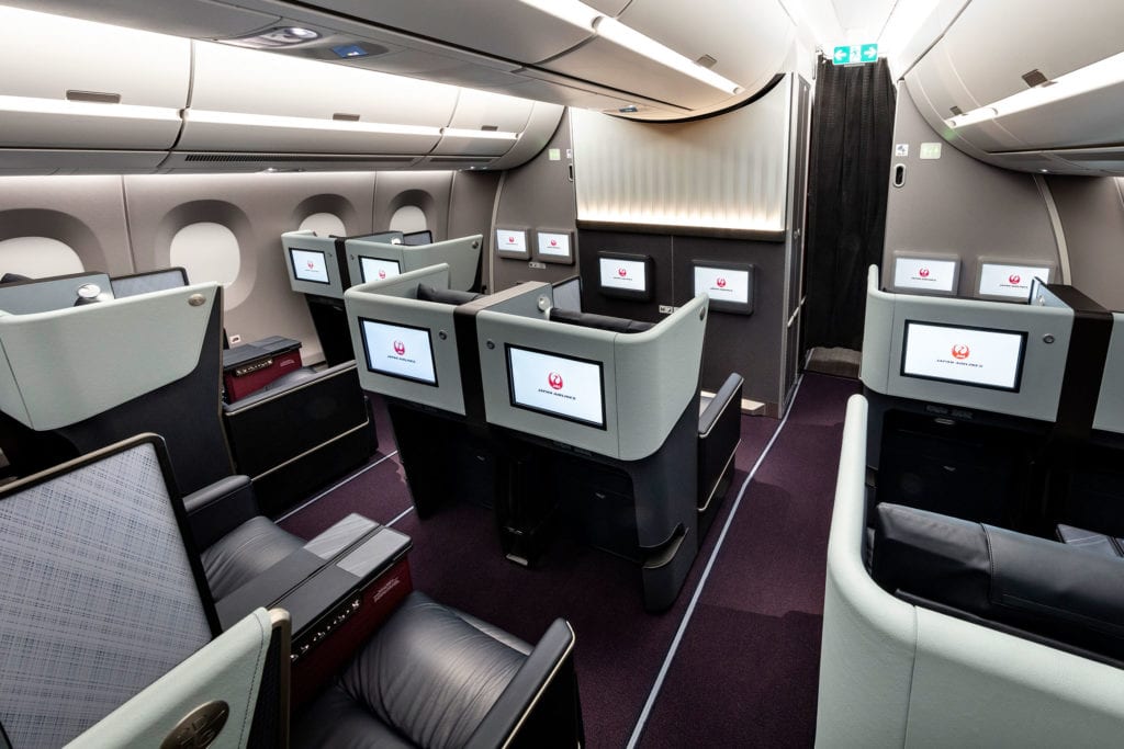
Texture abounds throughout the cabin, especially in first-class where the bulkhead features a pleated architectural form inspired by origami, the top of the seat shell is wrapped in ELeather’s engineered leather, which features a distinct grain and stitching and a semi-translucent privacy screen dons a hatched pattern. “On a sunny day, natural light will shine through the hatched pattern casting shadows into the cabin interior, similar to how air and light come through traditional woven bamboo homes in Japan,” Ishihara says.
In J Class, the name for the airline’s domestic business-class, rich textural play is achieved through the pairing of real leather and a soft woven fabric on the Recaro seats, whose widths are accentuated by the use of burgundy and dark blue color blocking. As passengers make their way through to the back of the cabin, they’ll see dark tones of greys, but from a seated vantage point, overlooking the backs of the seats, the cabin becomes crisp and white.
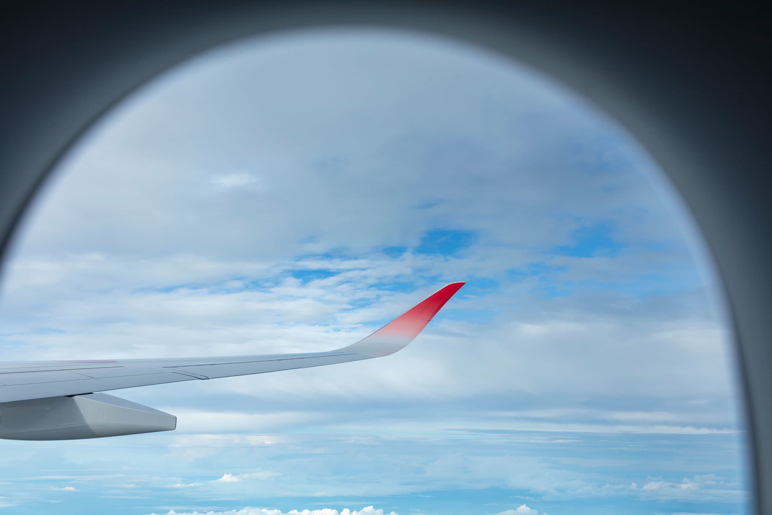
And while the scope of the project was initially limited to the interior of the aircraft, tangerine left its imprint on the livery as well, with the introduction of winglets dipped in JAL red diffusing into the white of the aircraft’s wing. “A photo of the colored winglet with a subtle gradient reminiscent to Japanese watercolor painting was on the cover of our presentation for three years, and eventually the project members and executives said they wanted to use it,” Ishihara recalls. “Since Airbus didn’t have the technology to do this, JAL sent some its engineers to Toulouse to spray paint by hand the aircraft one by one, hinting at Japanese handcrafts.”
“What we’ve landed on is something that feels like JAL across the whole customer experience, in every one of its cabins, and for all of its passengers – domestic and inbound,” Round says. “That was important because, in the coming months, all eyes will be on Japan.”


